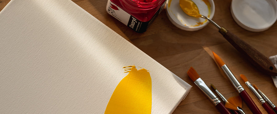

Paints are made of powder pigments and binders to keep the pigments together and help them adhere to a surface. The binder determines the paint’s viscosity, while pigment gives it its colour and opacity. There are two categories of pigments: organic (modern) and inorganic. When you’re blending paints, remember that pigments ofthe same category mix better because they share common properties.
Organic pigments
Organic pigments are carbon-based and produce mostly transparent colours. These colours dye and stain, and are very intense. Pigments may be natural such as carmine, gamboge gum, etc., or synthetic such as phthalocyanine, quinacridone, naphthol, perylene, perinone, dioxazine, hansa, azoic, thioindigo, etc.
Inorganic pigments
Inorganic pigments produce both transparent and opaque colours that take on a more natural tone when mixed. Pigments can be earth-based (ochre, sienna, umber, iron oxide, manganese and their derivatives,) mineral-based (ultramarine blue, vermilion,) or synthetic (white, cadmium, cobalt, Prussian blue, cerulean blue, chrome oxide, etc.).
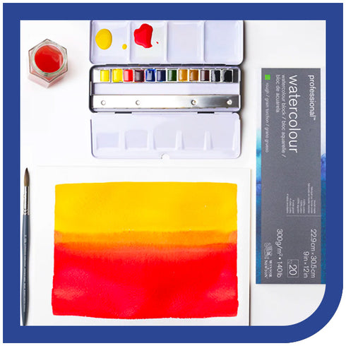
Mixing pigments
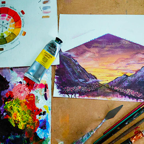
If you mix colours from different categories, you may not end up with the colour you wanted. Organic pigments tend to overwhelm a mix because of their intense colour, whereas inorganic pigments tend to fade into the background. But if you keep in mind the distinction between the two categories of pigments, you’ll be able to create beautiful colour mixes by using the right proportions. In theory, mixing two complementary colours will produce a neutral grey. This explains why it can be challenging to get vibrant secondary colours when mixing. Let’s take purple, for example, a colour that’s made with blue and red. But what sort of blue, and what shade of red? If you choose an orangey red (orange being blue’s complementary colour,) the orange-and-blue combination will create a grey tone, and as a result you’ll get a dull purple. You’ll see a similarly dull result if you use a greenish blue, since green is red’s complementary colour. Mixing a pinkish red with a purplish blue should produce good results. To help you through the colour mixing process, we recommend you have a colour wheel on hand when putting colour theory into practice.